About this website
You want to know a little more on the background of this website? Then you are right here. I will give you some information about what you will find here and how this page was developed. First of all, let me mention a few basic things. All the contents you will find here are my personal and private thoughts, pictures, technical and functional exercises or games. This web presence is non-commercial, non-political, non-religious and not in relation to my employer or any other person or company. This is just me as a private person. All of this here is my hobby.
If you should feel you would like to give some feedback, please use my contact page or just send me a short mail. I am happy to get an idea, what people think, which people visit and if I could improve something.
Contents:
The main content, I like to show here are my pictures as a hobby photographer. My main genres are:
This is where most of my work happens. I love to have my camera(s) with me on any kind of trip. |
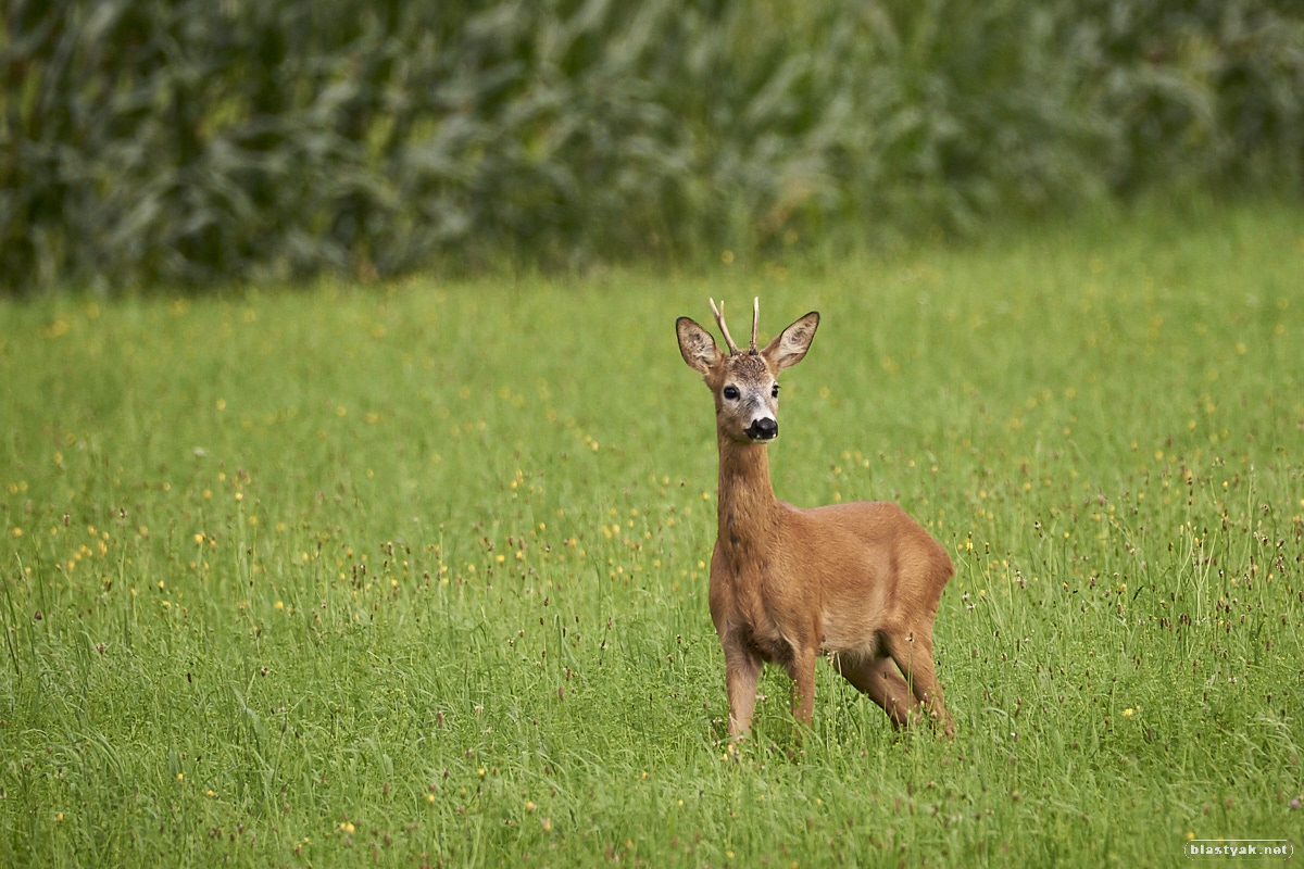
A genre, my fascination for has been growing. Started with macros and also want to get deeper into wildlife photography now. |
A genre I want to get deeper involved in, which is hindered a bit by my lack of models. |
I usually tend to allow using my pictures by other people. However please let me know, if you want to do so. First of all, I would like to know about and I am happy if my pictures are
appreciated. Second thing is that I might have to check with somebody else, if other people are illustrated.
If you should be interested in sharing this hobby, please feel free to get in touch with me. I like to talk to other photographers, see their work and exchange some knowledge.
Even better would be if you want to stand in front of the camera. I would really like to get involved deeper into people photography and am searching for interested models.
History:
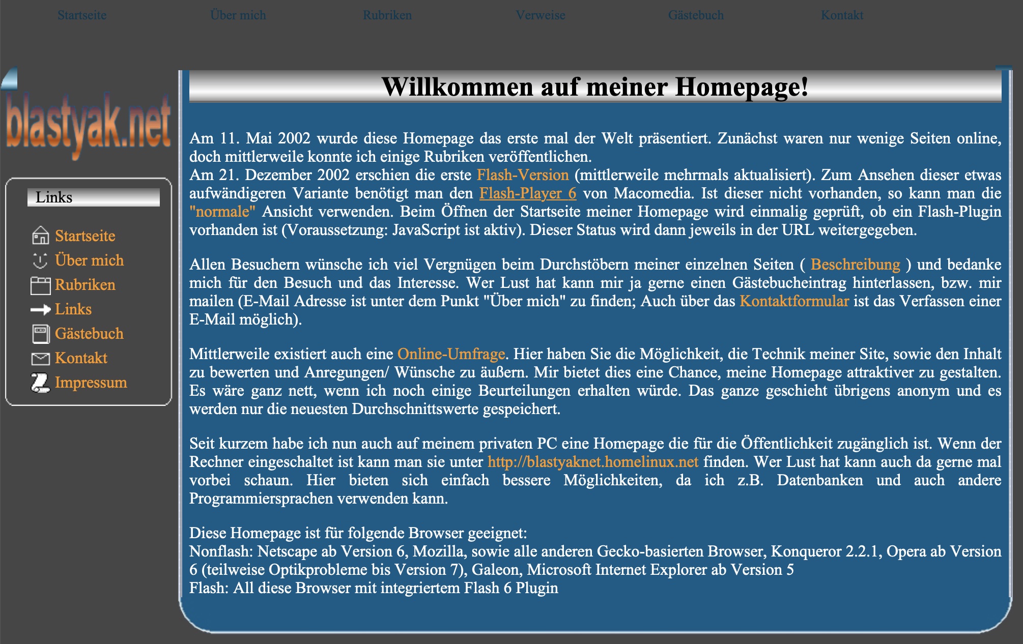
I started this website in 2002 as a trainee in my employers IT. The web was developing quickly and the standards, especially about design can be called "wild", even more the ones that were known to me. So version 1 of this website
contained a lot of color, mostly blue and orange. You can still find this in my logo. But imagine these colors spread over the whole layout paired with badly painted 3D borders (check below). I was young and needed the money (for other things),
so buying training and software was not my main focus. Of course, there was also a time, where Flash played a big role, so it was put in my site.
In the coming years until now, I improved my layout into a more professional direction. I could also introduce better features like the image slider. And of course, my ability as well as my software improved. Today, I hope to have reached a
contemporary design with an acceptable usability.
Here is a little histiory out of archive.org. Unfortunately not every version is completely flawlass, but it should give you an idea.
 |
 |
 |
 |
| 2002 | 2004 | 2013 | 2015 |
Next to the design, there was also a development in the content. In the beginning I collected a lot of stuff like HTML knowledge, coding knowledge, etc. But I had to recognize, other websites can cover this much more professional.
However what stayed from the beginning until now is the photography. So here comes a little more background on my way in photography: I started with this hobby in 2012, mainly because I was not satisfied with the pictures,
I brought home from my vacation in Scandinavia. So I bought a great book on how to take good pictures from Markus Wäger.
Soon, I decided that the compact camera would not be my friend for future trips any more and ordered a Nikon D7000 with my first two lenses. Over the years lots of equipment was added like additional lenses, flashes, tripods, hobby studio equipment,
backpacks, etc. Beginning of 2016, I wanted to make the next step and ordered my first full frame camera - the Nikon D750 in the kit with the Nikkor 24-120mm F4.0 lens. Photography got one of my major hobbies and this page was severely influenced by this process.
Also in software, there was quite some development. I started to work on my RAW files with Apple's Aperture. When they discontinued the product, I was searching for a new solution. I tested Phase One's Capture One Pro and Adobe's Lightroom.
Capture One Pro felt known right at the beginning and the available webinars helped tremendously in getting aquainted. Only after a few days, I already managed to produce better results than ever before. With this setup and a number of new CO releases, I continued for
several years focusing solely on my RAW converter and the retouching options it provided. When I bought my iPad Pro, I also wanted to test Affinity Photo. It brought another big improvement to my results, especially the restoration tool that helps to get rid of
unwanted elements in the picture. Since then I have also purchased all the other Affinity Products for my iPad and Mac. Affinity Designer is heavily used for all the icons on this website and Affinity Publisher is now my basis to create photo books.
All mentioned software can be found in the Links section within the top navigation, just in case things sounded interesting for you.
At the end, let me provide some information on the language. I started to use English as my main language some time ago, since my focus with colleagues and friends got more international. Many galleries are still in German and probably will stay like this. However everything new will be in English.
Acknowledgments:
Thanks to Vladimir Kharlampidi for Swiper, the image slider.

History
07/28/2021: Mesa Verde.
07/28/2021: Fluval Edge Tuning.
05/18/2021: Arches National Park.
05/16/2021: Bryce Canyon.
Micro-Blog
07/28/2021:
I introduced the new start page a few days ago. The idea was that a graphical shorter version would be better. People interested in the background of the website can find that in the about page. It also includes a short history now.
I also introduced the Projects sections with this update.
09/13/2020:
Today, the re-design went online. After a lot of changes and testing, I feel it is ready now.
With the new float design and the flat icons, I created a modern new look, made the page even more personal (all icons are now own creations) and hopefully achieved major improvements for mobile devices.
Please feel free to provide some feedback. I would very much appreciate it. Thanks.


